Saturday, September 10, 2011

Nudey Cutey Final

Two posts in two days...OMG!!

I've finished my first pinup girl. I'm calling them Nudey Cuteys, a corruption of my steam name. Yeah I'm a dork. Anywayses, some people are asking for more process...so what follows are a series of pics documenting her evolution. If you'd rather skip to the final output, then by all means scroll to the bottom :D

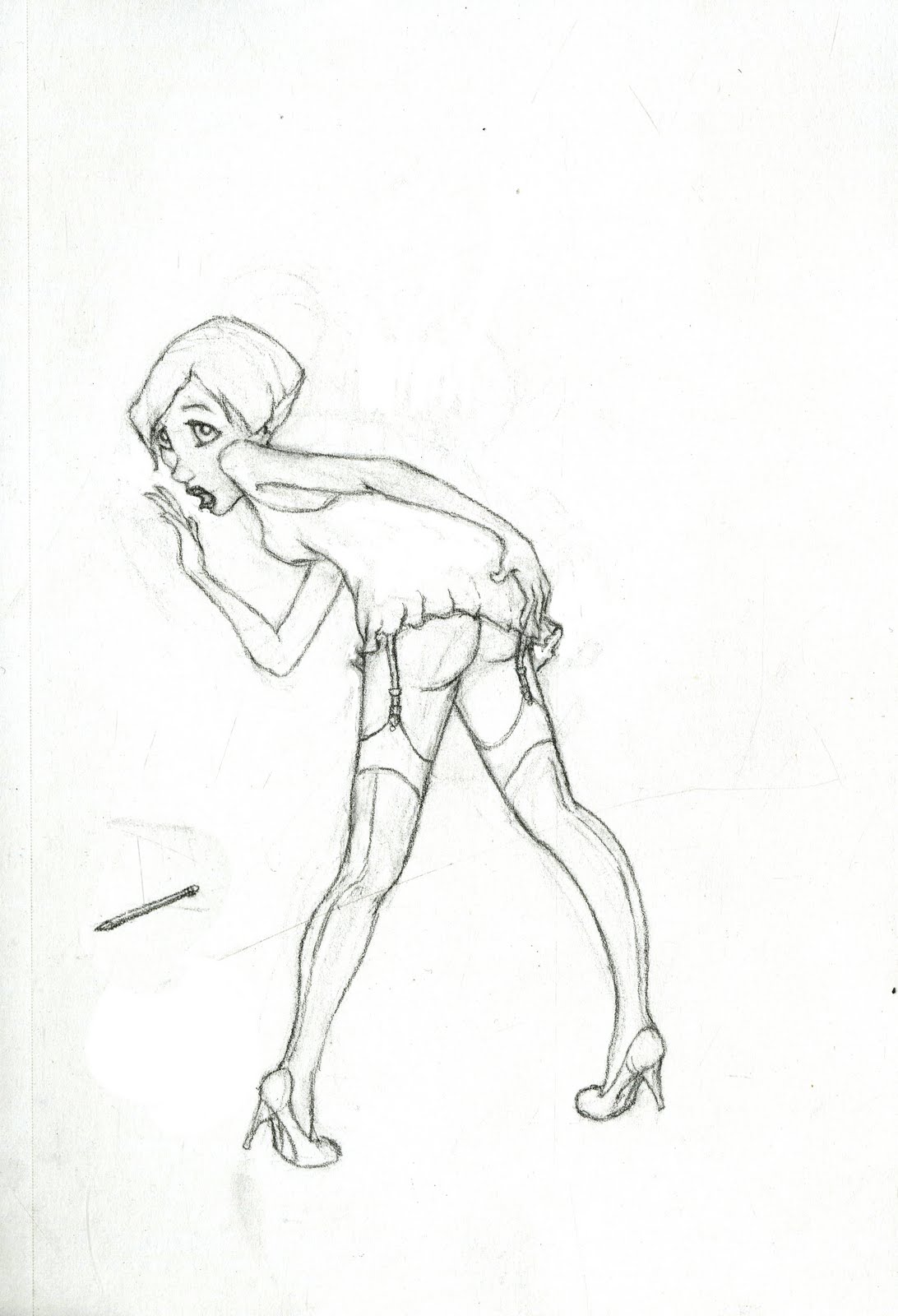
In case you've forgotten what pinup girl I'm referring to...here's the original line drawing http://noodle-kaboodle.blogspot.com/2011/08/nudey-cuteys-wip.html

For the sake of space, I'll keep these images small. Just click on any of 'em if you need to zoom in. So I started by making a clean contour drawing or 'inking' my original drawing in Photoshop.


I then proceeded to block in rough colors. I stole her colors straight out of a sunset I'd seen the night before. The slightly desaturated version I used looks a bit like cotton candy, which is awesome in its own right. I was also a bit influenced by Suicide Girls in her overall design, so it made sense to give her off-colored stockings and dyed hair. 


The one on the left was one of my first tries at integrating her into some sort of a background. I knew I wanted something abstract and asymmetrical. I tried giving her a ground plane in the first one and ultimately abandoned it. I didn't want it to interfere too much with her lovely silhouette. The second picture involved me playing with circles. It got a little out of hand and started looking too busy. 


However, I kept one layer of the circles as it was simpler, integrated her with the pencil, and echoed many of the triangles in my composition (her hair, her spread legs, etc.). Also, it looks kind of like a giant ellipsis and that is one of my favorite grammatical symbols...Yesh I'm a big grammar nerd.

I then set about adding some simple details and tones, which you can see above. 

Below is my final, wherein I went in and colored all of my original lines. If you've ever seen a Disney film, then you know where I stole the idea from.

And yes I know I just published triplet babies between two pinup girls. Shettup. Who says cute and sexy can't go together...


Thursday, September 8, 2011

Curse of Three WIP

So, various friends are yelling at me for infrequent updates :P

Here's a piece I'm working on, inspired by my friend antpwny. He and his girlfriend are both Asian and I was teasing that they need to pop out Asian babies. This conversation ensued...

antpwny ♥ (@'.')@ : yeah we're having only 2 kids =X
noodles & co.: lame
antpwny ♥ (@'.')@ : that's all she wants
antpwny ♥ (@'.')@ : probably all i can handle anyways
antpwny ♥ (@'.')@ : we'd rather only have 2
antpwny ♥ (@'.')@ : we dont' want that big of a family
antpwny ♥ (@'.')@ : we come from big families
noodles & co.: i shall now curse you to have triplets on the first try
noodles & co.: so ha
antpwny ♥ (@'.')@ : =X
noodles & co.: triplets for anty
noodles & co.: TRIPLETS!!!!
antpwny ♥ (@'.')@ : =X
antpwny ♥ (@'.')@ : that sounds hard to do :o
noodles & co.: i shall draw triplet asian babies
noodles & co.: with your names on it
antpwny ♥ (@'.')@ : =X
noodles & co.: and burn it in an incense burner
noodles & co.: isnt that how chinese get their wishes...they have all kinds of rituals like that
antpwny ♥ (@'.')@ : no clue
antpwny ♥ (@'.')@ : =X
antpwny ♥ (@'.')@ : only half chinese

I then drew myself hovering over an incense burner with three lil asian babies in a cloud of smoke. 
They started out as rough pencil drawings in my sketchbook...


I then took some of my favorites into Photoshop and inked over them with nice clean contours.

Yeah, I know there's no smoke in this line drawing. But the placeholder smoke I had was terribad, so I eliminated that from this upload. Next to clean up the smoke and color everything. 

Hopefully no one will confuse this with me hoping for Asian babies of my own. I refuse!


Tuesday, August 23, 2011

Nudey Cuteys WIP

Pencil sketch of a pinup girl I've been working on. Needs some more cleaning up and probably gonna color her in Photoshop. Thought I'd post progress pics anyway :D


Saturday, August 20, 2011

New Banner Yay!!

Finally got around to designing a custom banner for my blog. For those wondering where/what it is...look up at the header/ title bar.


My previous template was not my own creation and, while aesthetically pleasing, caused a lot of functionality problems. I had to tweak a lot of html to make the facebook/ email buttons compatible. Various labels were in Spanish and I had a heckuva time trying to find and replace them. Oh... the trials and tribulations of playing with someone else's toys.

So I finally got kicked hard enough to generate motion when a friend pointed out that the embedded comment form wasn't working. Without the patience or coding expertise, I decided the simplest answer was the best one. Scrap the whole template. Put some mild changes on a simple template and design a banner. Feels much more personal and no more checking bugs, when I would rather be making arts ^_^

My inspiration was rather simple...it's a noodle (me), pulling out strands of hair that bear a striking resemblance to...noodles of course. To my dear Steam friends who have no idea what I look like, yes I am Asian....and no, I will not post pics to prove it :P

The font is Piron V.2, a lovely design by the folks at Typedepot. It's free for both personal and commercial use. If you'd like to get your hands on it, look no further. Piron, along with some other sexy fonts can be found here  http://www.typedepot.com/piron
[While Piron is free, not all of their fonts have the same license. Double check before using.]

Tuesday, August 16, 2011

Can We Fix It With Duct Tape?

Yes, I know it's been awhile since I posted. I am still alive...and drawing *gasp* As part of my return to blogging, I wanted to post a piece to Society 6, a kind of Etsy for 2D artists. A friend introduced me to it recently and I fell in love. In case you're unfamiliar, here's the link. http://society6.com/
Lot of great work there.

Since I hoped to print at the largest size Society 6 allows, I set my dimensions accordingly in Photoshop. However, this was the first time I worked that large digitally. So, I set the size to roughly 28 x 32 and the dpi to 300... If you have no idea what that means, I essentially made my file 3-5 times larger than it needed to be. Oops. It took Photoshop crashing my computer for me to realize that I'd made a big mistake. My image files were around half a gig each!

So after reading up on how to deal with large format in Photoshop, I realized that I could have worked in a lower dpi or dimensions... Well, live and learn. :P  In the mean time, it's nice to know I can make prints that cover my entire office wall.

If you're interested in buying prints, t-shirts, etc., here's the society 6 page
http://society6.com/nudel/Can-We-Fix-It-With-Duct-Tape_Print
house sized prints not available :P

Original Print

T-shirt Design
My inspiration was a response to how to mend a broken heart... can we fix it with duct tape?

It went through several iterations...cartoony, dark and brooding...I even had an amorphous painterly background at one point. I finally decided on symmetrical patterning with a little decay. Was very fun to make. More to come in the future :D

Sunday, May 22, 2011

Drawing Ethnicity Part 2: African

Part 2 of my study focuses on people of African descent. Now I know that this demograph in particular has been significantly diluted in Europe and the Americas, where there is even greater variation in phenomes. Which is why for now I am focusing on the traits of Africans and not African Americans. It's a broad category...but I'm going broad for now. Later on I may get into the differences between Ethiopians and South Africans and Chinese vs. Japanese. But for now, I'm just trying to start big and work my way down.

Also, this is my first real try at drawing Africans. And I have to say right now... drawing a black woman's hair is stupidly fun. There's such a variety in shape and texture. It really takes on it's own character and I love it. 


Also, yes I know that I've neglected men at this point. They'll get their turn soon. 

Saturday, May 21, 2011

Drawing Ethnicity Part 1: Indian

It's true that as an artist you put a little bit of your self into your work. Quite literally!

In fact, it can be difficult at times to avoid giving all your creations your facial features. This is not so much the result of arrogance as falling back on familiarity. You see your face in the mirror everyday. It is so familiar to you that any faces you imagine begin to unconsciously take on some of its features. This became quite apparent to me when I took on the task of portraiture. I discovered quickly my initial instinct to give everyone Asian eyes. 

There are ways around this of course. The importance of reference cannot be stressed nearly enough. However, while plenty of texts cover the human face and its anatomy, there are nearly no studies of the subtle variations that aid in delineating different races. Perhaps this is because such talk is often deemed as racist and taboo. But that couldn't be further from the truth. By not studying how to render different ethnicities on paper, I can only create one ethnicity successfully...my own. The result is a culture far more homogenized than the one traditionally avoided by the politically correct. 

To that end, I have begun my own personal studies of rendering different races. It's not terribly scientific (b/c I'm not a scientist) and involves a lot of pouring through Google Images. I find that the culture's own artwork is a great place for me to start for two reasons: 

1) art demands a certain amount of simplification
2) art tends to represent the cultural ideal

In other words, that which a culture chooses to represent itself is likely that culture's idea of beauty. This helps me avoid any personal bias, while still focusing on distinguishing features.


Tuesday, May 17, 2011

Wednesday, May 4, 2011

Gesture Jam

So here are a few gestures to tide you over. SCAD has a Gesture Jam this Friday, organized by a few Foundations professors. These are from the last Gesture Jam, which I happened upon quite by accident. The professors did a sketch off / demo of their gesturing styles...followed by lots of gesture drawing...followed by pizza, which ran out. Anywayses...Prof. Salinas advised everyone to gesture in pen because it's quicker than sharpening a pencil. I was a lil leery at first. I hate not being able to erase. But once I started drawing, I forgot it was in ink. Thanks to the models btw for giving some really fun expressive poses.

Click on any image to enlarge

Wednesday, April 27, 2011

Character Evolution

Ok so I've finally hit upon some character designs that I like. Thought I'd share the design process that led me there. The girl first. I’ve been sketching her for forever and she’s certainly undergone a crazy transformation.

Early character design from storyboards
There are more crazy designs than this...but I won't post them...as they are far too embarrassing.


Awhile back, I tried turning my music video into more of a narrative. That necessitated more facial expression and more realistic anatomy. While I eventually scrapped that notion, there are still elements of the character on the right that I like and tried to retain.

Recent sketches
Also trying to contrast the other passengers with the girl by giving them more square and rectangular heads as opposed to her more organic circular head.I decided the really boxy head looked kind of elderly from the front. So I tried to make it more octagonal. Then I started making it look more childlike and before I knew it... I had a design that was appealing but...not quite what I wanted. I realized not only was it kind of detailed, but it was really individualistic...exactly not the direction I needed. The passengers were supposed to be robotic and almost zombie like. They needed to conform.


The image on the right looked so simplistic compared to the child...but that simple very clear silhouette was exactly what I wanted. So...I did what would make the most sense when you want your characters to conform...I cloned him. Then with that same line to unify them, I just tweaked the passengers to distinguish them...but not enough to make them unique individuals (Below).


This will make animating them even simpler...b/c I can simply use the same body animation for all of the characters and swap out clothing/hair secondary animation on a second level... rather than fully animating each one.

With a more confident design for the passengers, the next step was making our leading lady mesh with her peers. As it stands, the more rounded features and expressiveness made her stick out a little too much. Obviously some of her more extreme organic shapes and individuality had to give way so that she didn’t look like she belonged in another film. Also, if I was going to give her pupils (necessary for her to have any kind of meaningful facial expression)... the other passengers would need them too...so they meshed together better.


Another option...rather than making the girl expressive and more of a traditional Disney-esque design...I could make her look more like the passengers. Keep in mind that as iconoclastic as she appears during most of the bus scenes, she does conform in the end. Having a very contrasting design might make her stand out too much for those scenes. For that purpose, I tried to see what she might look like if I tried to make her look more like the passengers to begin with.


The result (on the left) doesn’t look like it would be as fun to animate. But as my teacher insightfully noted... mine is a rhythmic piece, not a character piece. So is really expressive character animation necessary?

Then it occurred to me, why can’t I have both. And what better way to demonstrate the girl’s transformation...at the start and end... then if she has no pupils when she plugs in like the other drones and only gets them when she unplugs. The same would apply to all the characters.

Before...                              After...

Still need to finalize these designs and make polished turn arounds. Will post those along with color studies next. Any thoughts/ suggestions before I move forward with this design?


Halo!!


“On the subject of blogs: I have ‘no need to engage in [the] polluting of the internet by narcissistically posting every meaningless moment of my life in such masturbatory fashion.’ ”

- Chris Jadatz (taken from Matt DeWitt’s Facebook profile)


After trying to avoid the blogging hook for years, I decided that my sketches and concept work needed a home.

With that said...what follows is a dump of recent work on my short film. Initially, these will be primarily for people already familiar with my piece. I'm in the process of acquiring music rights. So as of right now my animatic cannot be uploaded.


  • Basic premise: Commuters on a bus nod blandly to a common beat. While their headphones and cell phones blind them to the world around them, one passenger unplugs and gets a surprising glimpse of the world outside.


  • Treatment: This is primarily a rhythmic piece. No dialogue, but the action/shot flow will sync with various elements of the music. Exteriors will be rather abstract and organic, while scenes within the bus will reinforce a sense of drab apathy through desaturation and robotic movement.


  • Color Studies

    First, thumbnail color studies for the bus interior. Primarily focused on textures and framing in the first study. So you'll have to excuse the lazy linear perspective and muddy light sources. Then, I decided that the muted olive green and dusty brown had too much of a military connotation.

     Next on the list...Slate blue. Desaturated and cold feeling...but maybe a lil too cold.
     Greyscale just for good measure, though I don't plan on using it. As a stylistic choice, it seems too obvious to the point of being generic.

    My favorite so far...a kind of muted purple. I like the slight warmth the red hint gives off as opposed to the blue earlier.
    This post is getting long...To be cont.